UX DESIGN
THE WEATHER CHANNEL FACEBOOK MESSENGER BOT
Denise Francis
BRIEF
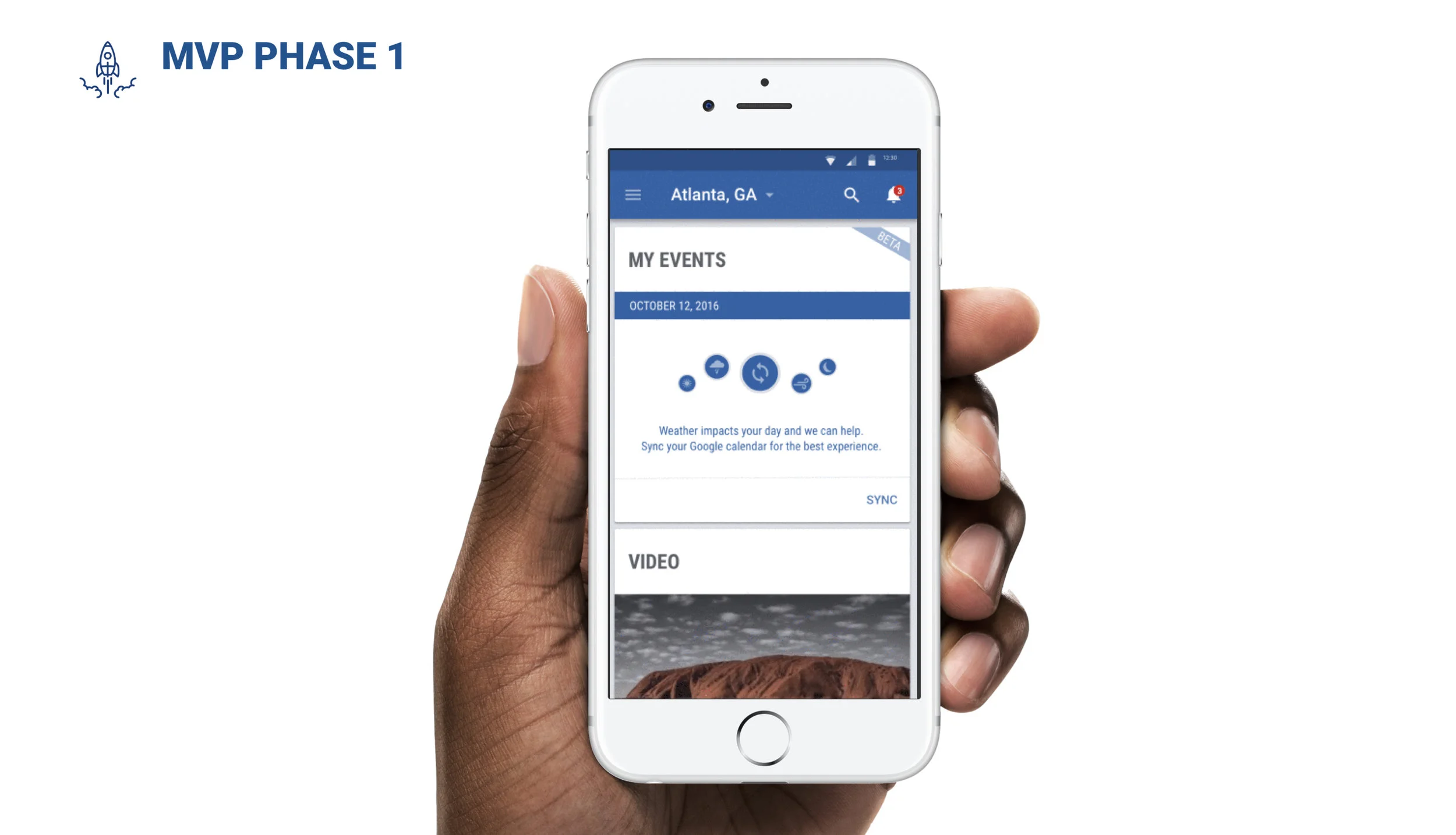
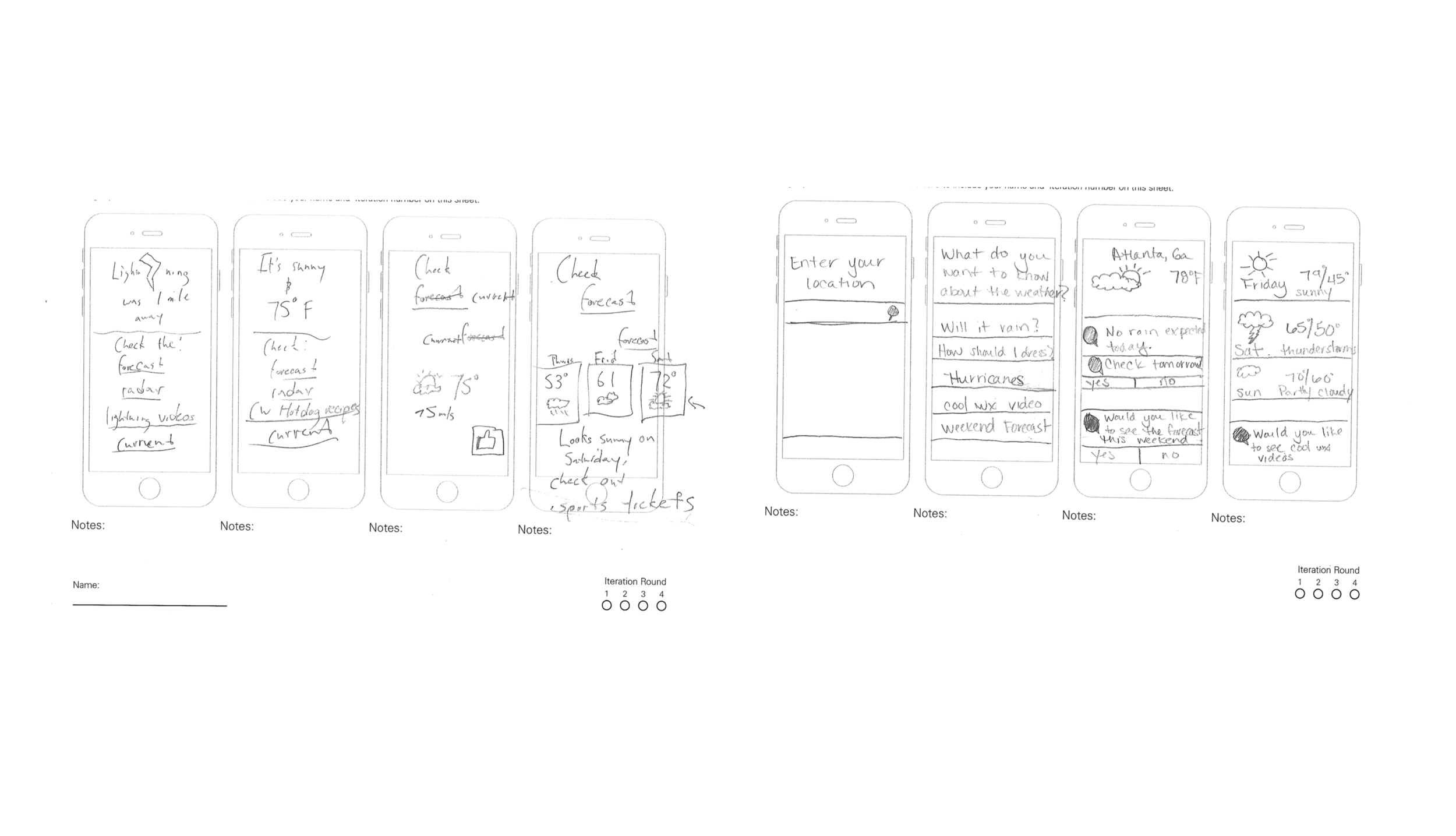
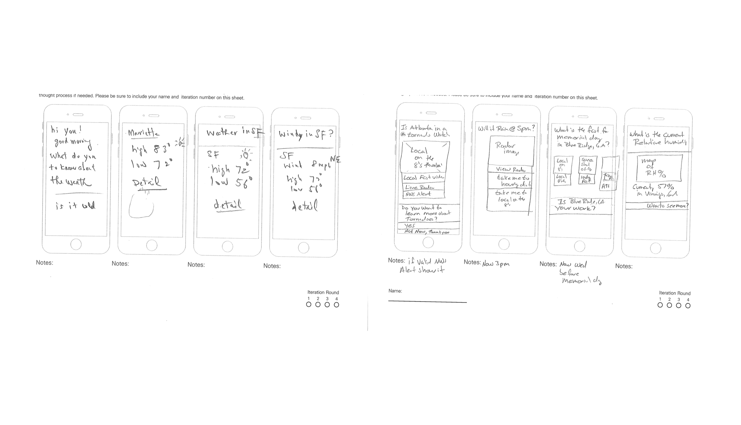
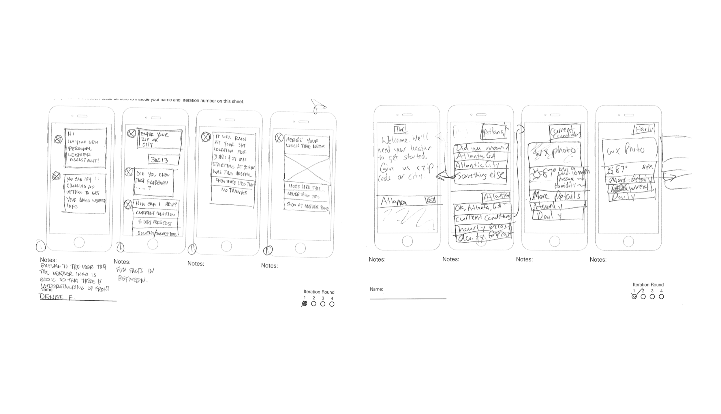
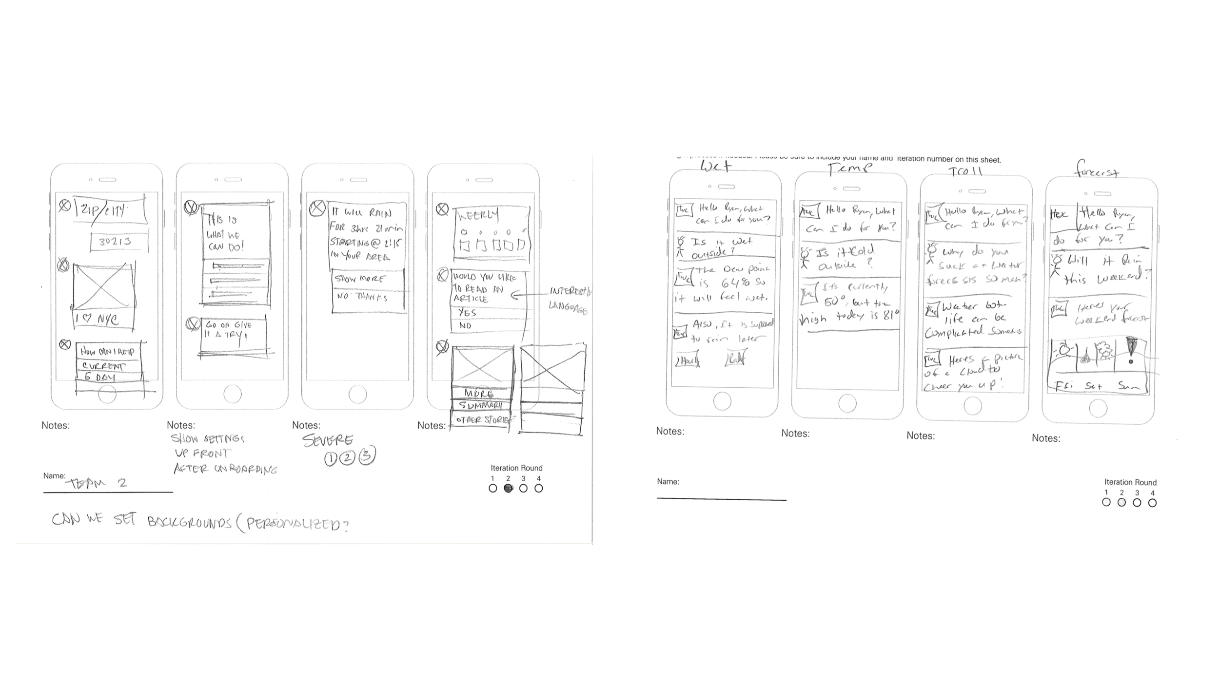
The Weather Channel Facebook Messenger Bot is the best weather bot option for accurate forecasts and timely local weather alerts. It allows users to make confident decisions whether planning for the day, entire week, or extended forecast.
MY ROLE
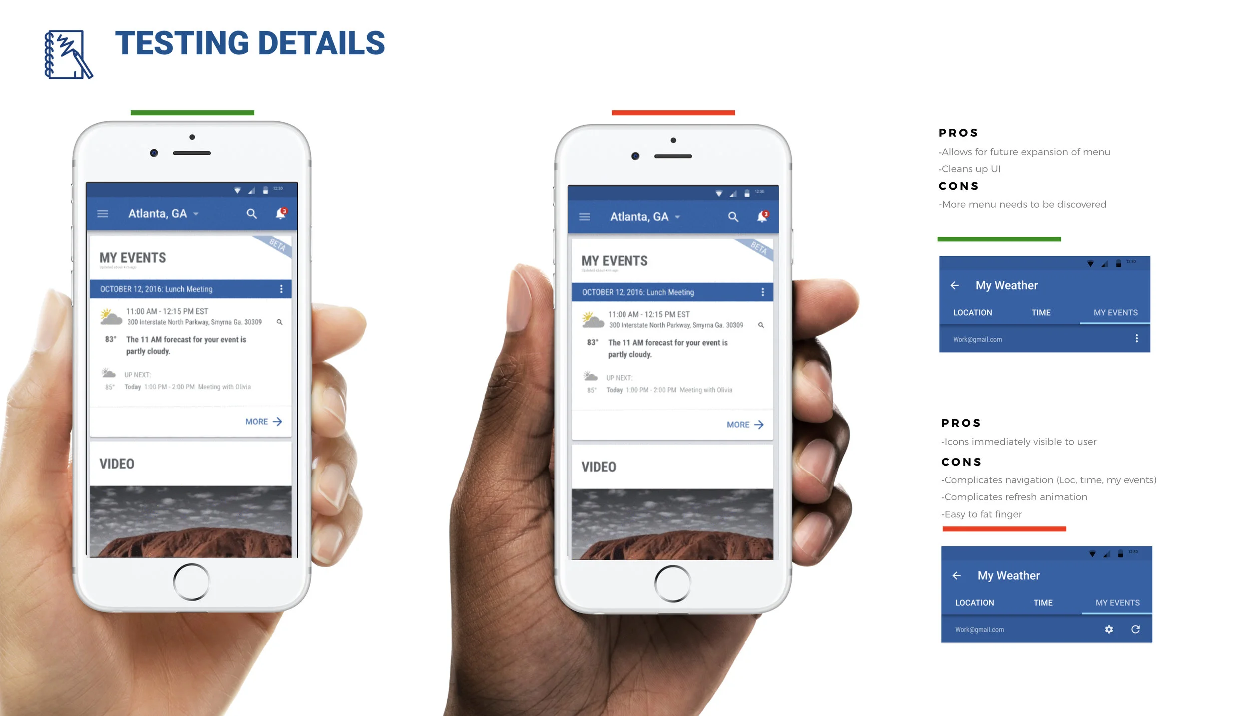
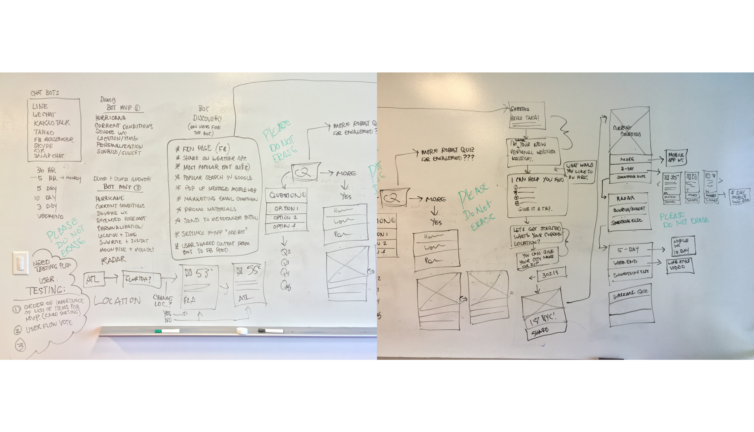
Product Designer. Most would recognize this role as a full stack UX|UI designer. Responsibilities included conceptualizing a weather chatbot from start to finish, including the user experience flow and the visual direction under the limitations of Facebook's platform. Also included assisting in the development of the bot's tone (which sparked a larger conversation about voice tone throughout The Weather Channel's brand), as well as solving user conversation habits and challenges that allowed the user to speak freely, display trust, and understand the difference between a pure human vs. robot conversational experience.
METHODOLOGIES
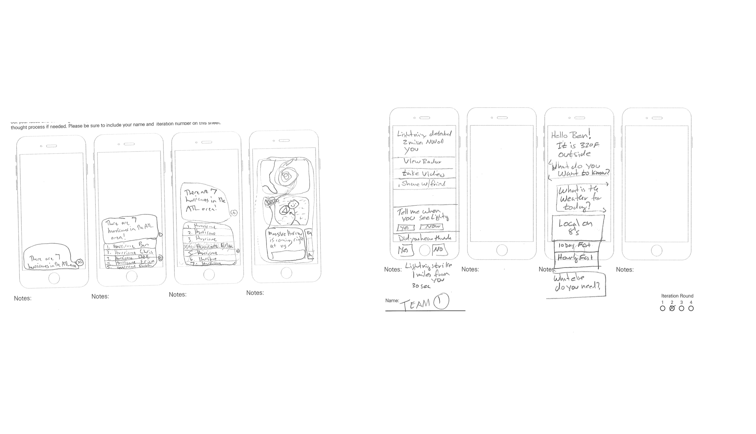
Guerrilla Tests, Personas, User Flows, Extensive Market Research, Sketching, Live Prototyping, Comparative & Competitive Analysis, and Wizard of Oz User Testing.
TOOLS
Sketch, Facebook, Google Suite, Adobe Illustrator, and Adobe Photoshop..
What is a chatbot?
OLLI | AUTONOMOUS FOR ALL OF US
Denise Francis
BRIEF
The Weather Channel Facebook Messenger Bot is the best weather bot option for accurate forecasts and timely local weather alerts. It allows users to make confident decisions whether planning for the day, entire week, or extended forecast.
MY ROLE
Product Designer. Most would recognize this role as a full stack UX|UI designer. Responsibilities included conceptualizing a weather chatbot from start to finish, including the user experience flow and the visual direction under the limitations of Facebook's platform. Also included assisting in the development of the bot's tone (which sparked a larger conversation about voice tone throughout The Weather Channel's brand), as well as solving user conversation habits and challenges that allowed the user to speak freely, display trust, and understand the difference between a pure human vs. robot conversational experience.
METHODOLOGIES
Guerrilla Tests, Personas, User Flows, Extensive Market Research, Sketching, Live Prototyping, Comparative & Competitive Analysis, and Wizard of Oz User Testing.
TOOLS
Sketch, Facebook, Google Suite, Adobe Illustrator, and Adobe Photoshop..
What is a chatbot?
So what is an autonomous vehicle? Well. We finally have self driving cars. And they are finally getting good.
So typically as a public commuter there are several steps to getting to and from various destinations. Olli makes it easy by creating routes that allow for simple navigation, departure and arrival to your destination.
Now imagine that you have an ailment that extremely slows down your travel making it hard to navigate the world. What would be some of the things you’d have to think about? We empathized with this mindset and began to pin point the pain points and concerns so that we could begin to create the right solutions.
So we started to think about some of those pain points and how we can solve them via the technology and physical spaces available to us using the screens at the bus stop and on the bus
We began to sketch and brain storm all while checking in with our engineers to ensure that we could reach an MVP that would’t frustrate its users, knowing that this will ALWAYS and continue to be a learning process.
We then began to set the mood by exploring materials, textures, tactile engagement
We incorporated systems into those screens and monitors to allow users to communicate and gain information in ways thats best for them.
From there we arrived at a flow that supported our initial MVP to be tested at an up coming CES Conference.
The we put it in front of people. Spectators got the opportunity to meet various user personas and experience the vehicle. Designing for an exhibit (approximating a real life experience within the constraints of an exhibit hall booth) as well as a real life actually-in-use experience.
And there's always that moment when you get the ultimate user testers … Exciting!
This project taught us a lot about execution but it also was a huge lesson in just how much communication can improve a product.
NOBODY KNOWS OR CARES ABOUT THE SILOS WITHIN YOUR COMPANY.
It’s not black and white. It is so important to design a product that everyone can use. Learn about color contrast rules and font weights and sizes. Disabilities range from temporary issues like headaches, to a broken hand. There’s also a legal mandate to comply with certain accessibility standards.
Name Headers
Describe Images
Color Contrast
There are so many screens, too many clicks to find what you need. Make that the priority then make a second step. Try to avoid exhausting the users.
What user need are you solving? Never forget what you’re helping users achieve. You are their advocate!
We got the opportunity to present this project at the 2018 We Rise Tech Conference in Atlanta, Ga. and look forward to presenting it at more conferences in the future.
KANGA MOBILE APP REDESIGN CASE STUDY
Denise Francis
“I love this app because I am able to track my order from start until finish. I also really like being able to share my delivery’s ETA. The new Kanga has a user interface that’s easy and fun and, I really appreciate that.”
BRIEF
Kanga is an app that offers quick, on demand, local delivery. They deliver anything, from furniture to pies. Their brand is really fun and exciting but their current app was lacking a feeling of security and safety. The main task for this project was to inject their brand into their app while also adding a sense of trustworthiness and security
MY ROLE
My role for this project included: Competitive research, brand analysis, current application analysis, persona building, storyboarding, concept development, high fidelity mock ups, market research, user survey research, project tone, and presentation branding and identity.
METHODOLOGIES
Guerrilla Tests, Personas, User Flows, Extensive Market Research, App Map, Sketching, Journey Map, Wireframes: Low-fidelity & High-fidelity, Prototyping, Comparative & Competitive Analysis, and User Testing.
TOOLS
Axure, Sketch, Marvel, Keynote, Adobe Illustrator, Adobe Photoshop, and The Noun Project.
DISCOVERY & RESEARCH
Initial research began with a digital survey that included 32 participants. The purpose of this survey was to get a good understanding of user interests, delivery service pain points, and common industry experiences. We followed that research with a digital card sorting exercise, in which we had 48 participants, the goal was to find the most preferred task flow within the app.
ANALYSIS
Through a deep competitive analysis, it was clear that Kanga is different than anyone else on the market. Kanga focuses on three main business channels; consumer to consumer, local business partnerships, and their cutting edge technology platform. Kanga delivers anything and every thing locally.
OR
CLICK THROUGH THE PROTOTYPE BELOW (TAP TO BEGIN)
NETFLIX MIXFLIX | RESPONSIVE FEATURE CASE STUDY
Denise Francis
We did a case study on the media streaming service Netflix, a leader in its field offering flexibility in disc by mail and streaming. Netflix is a fresh organization that has over 62.3 million subscribers in over 40 countries. Its notable for receiving many awards for its innovative original series including House of Cards and Orange is the New Black!
So of course we started with a comparative analysis but focused on the difference between Netflix, Amazon Instant, and Hulu Plus, and although Netflix is leading in its field Amazon Instant is giving them a run for their money.
After conducting a survey we found many results … including what types of people use Netflix, how they use it, along with how they wish they could use it.
Olivia is a special case. Her boyfriend David proposed to her right before leaving for a military base. Finding herself feeling alone, she often gets frustrated with failed skype and facetime calls. She just wants to spend time with David. She read an article on buzzed.com about how Netflix is adding a new co watching feature and thought she’d check it out.
PET AGREE | MOBILE CASE STUDY
Denise Francis
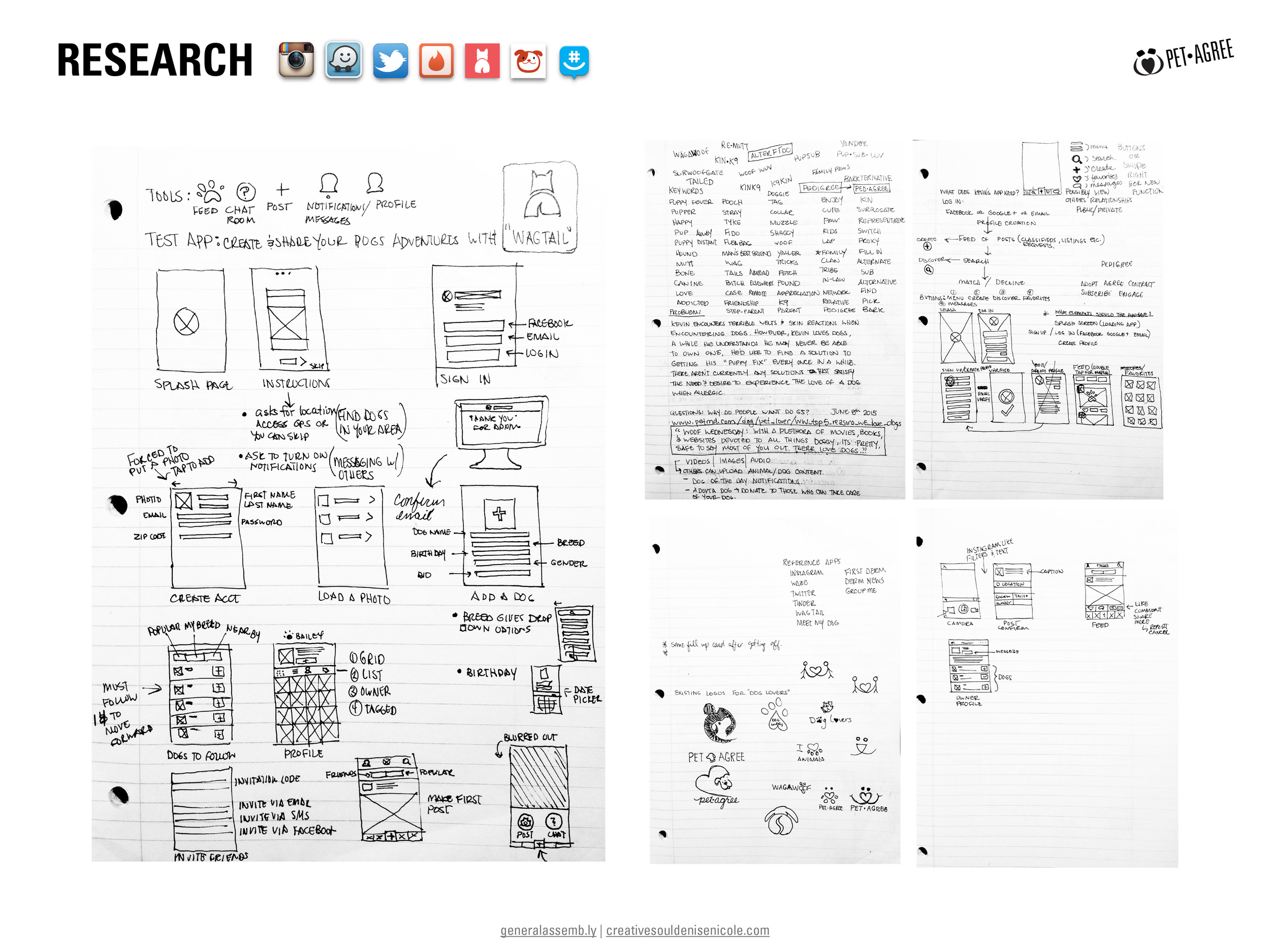
After interviewing Kevin, and exploring the views of others who also cannot have dogs, the solution of a surrogate adoption came to light. Which brings us to PET AGREE
Here, a potential identity has been thought out for the design. This logo would conceptually merge the idea of people agreeing to help others love and care for dogs.
After interviews, research, and sketching the design began to take on characteristics from existing apps that relate in some way. These apps include: Instagram, Waze, Twitter, Tinder, Wagtail, Meet My Dog, and GroupMe.
The flow begins with the choice to download the app. The it moves into the logistics of Kevin as a user of the app.
The first attempt at sketch iteration proved that there were corrections to be made. After meeting with Kevin and presenting the sketches, changes and glitches were highlighted.
Here the app is processed as a paper prototype which allows for further testing and preparation for a future clickable (low fidelity) prototype.
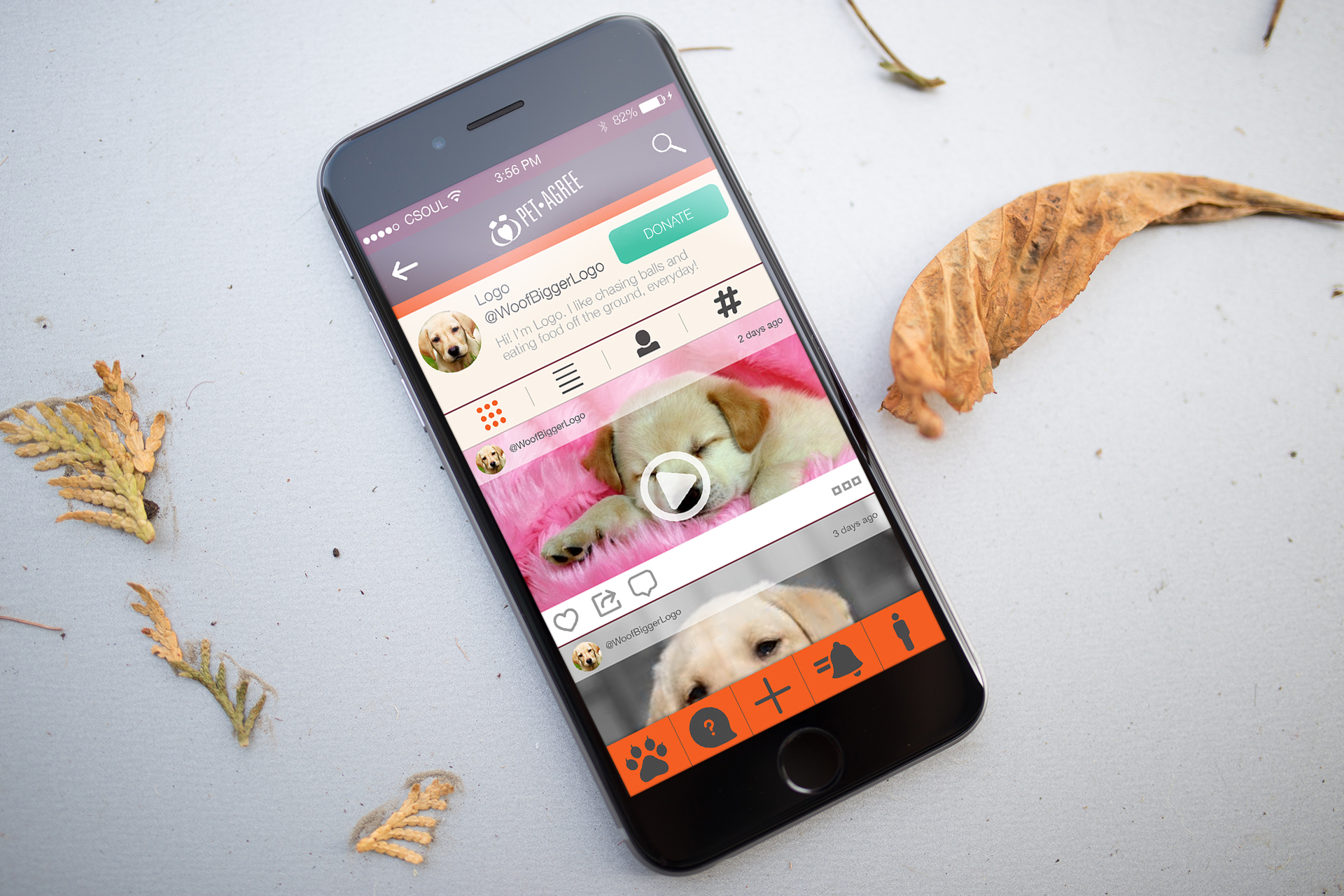
During the second iteration these sketches were created. Highlighted here, profiles are created for dogs by their owners so that others can view or decide if they’d like to adopt. Users can view photos, video, and hear stories about popular dogs in the app or dogs they follow or have adopted. Users can discuss all things doggie including care assistance, allergen solutions, and other topics related to making dog ownership a great experience. Now, for a deeper look into Pet Agree.
OR
CLICK THROUGH THE PROTOTYPE BELOW
PARIS ON PONCE | AN E-COMMERCE CASE STUDY
Denise Francis
Paris on Ponce is located in the Old Forth Ward area of downtown Atlanta and is filled with unique home decor, furniture, housewares, and gifts. It has also been know to appear on HGTV and other DIY networks nationwide. Over the last 17 years, Paris on Ponce has become Atlanta’s favorite bohemian destination. There are superb bargains side-by-side with genuine investment pieces, in a constantly updated and unfolding series of quirky vignettes and elegant room settings.
A competitive analysis study was conducted, informing that the paris on ponce site could use an site face lift and an “Items sold on web” feature, or e-commerce component including home delivery. Focusing on these elements could send paris on ponce beyond their competitors in sales.
After studying the pages of the site some solutions were discovered such as, merging the home and blog pages, including the press, faqs, and about content on a single “info” page, including prop rental and photoshoot information on the venue page, as well as adding a shopping experience to the site.
The next element to study was a comparison analysis of how other similar sites manage navigation for e-commerce opportunities so that categories for the site could be established.
The first portion of research catered to the creation of the new shop online feature. A series of card sorting activities were conducted to understand the categorization of the items to be placed in the shop for sale.
From there, the sketched wireframe process began. The process began with discovering the essential elements for the home page.
Here set backs happened, goals emerged, solutions came about, and ideas were created for each page of the site.
